


Making an interactive data visualisation, Part 1
Published on 28 Jul 2022
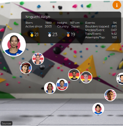
I’ll start this post with a little bit of background on why I made the visualisation in the first place. Now, I am really into climbing. Though I’m not particularly good at it, I do it quite a bit. I’m into it so much that I’ve been watching pretty much all the top-tier climbing competitions for the past few years. So, when I decided to find some data and do something fun with it in order to build up my data science portfolio after I quit being a uni teacher, climbing data were the obvious choice. I didn’t know what kind of data I would be able to get or what I would do once I have them but I was quite excited. The fun thing about projects like these is that you end up not only exercising your creative, design, and analytical skills but also learning something new about the subject matter. For example, I always knew that Akiyo Noguchi was pretty amazing, but playing with the app made me learn more about quite how amazing she was1. Finding Data There is no one right way of going about a project like this. You can, if you wish, start at the drawing board and design the end product and then figure out how to make it.