Motivation
I was reading Adam Mastroianni’s excellent blog post on peer review (it’s really good, go check it out) because it’s Christmas time and I don’t have to be a code monkey for a while. To give an example of the kind of rubbish that somehow makes it through peer review, Adam calls to his aid a tweet many of you will have seen but for me it was a revelation:
Wait a second, these are not real error bars … the author literally just put the letter “T” above the bar graphs 😭 pic.twitter.com/KKtTGRHFaw
— Josemari Feliciano (@jmtfeliciano) November 28, 2022
Going by the lively discussion in the thread, many people seem just as appreciative of this galaxy-brain-level of problem solving as I was.
Now, I’d heard of Advances in Materials Science and Engineering, the journal that published the now retracted paper that this figure is from, on the Everything Herz podcast hosted by the young researcher of the year Dan Quintana and the curmudgeonly self-indulgent academia survivor James Heathers (again, go check it out!) but I wasn’t ready for quite this level of hilarity.
I simply think that having Ts for errorbars is wonderful and everyone should start doing it from now on. That’s why I bring you today ggterror, an extension to R’s ggplot2 package that allows you to do exactly that. Because it’s Christmas time and though I don’t have to be a code monkey for a while, deep down I guess I know that I really am a code monkey…
Unlike the graphics in the original – and this word is doing a lot of work here – paper, this extension produces actual errorbars.
Installation
ggterror is hosted on my GitHub so help yourself:
remotes::install_github("mivalek/ggterror")
Usage
The package contains a single function geom_terrorbar() that should be used in much the same way as ggplot2::geom_errorbar()
library(ggplot2)
library(ggterror)

palmerpenguins::penguins |>
    dplyr::filter(!is.na(body_mass_g)) |>
    dplyr::group_by(species) |>
    dplyr::summarise(
        mean = mean(body_mass_g),
        se = sd(body_mass_g) / sqrt(dplyr::n())
        ) |>
        ggplot(aes(x = species, y = mean)) + geom_terrorbar(aes(ymin = mean - 2 * se, ymax = mean + 2 * se)) +
        geom_point() +
        theme_bw()
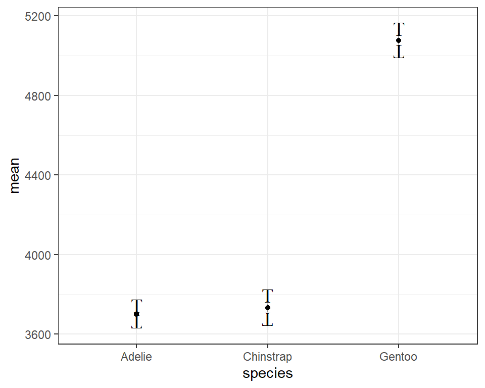
On top of the usual aesthetics you’d pass to ggplot2::geom_errorbar(), this function takes a few additional arguments that govern the overal look of the Ts and the connecting lines:
connect- logical. Whether or not the Ts should be connected with a line.fontface- one ofc("plain", "bold", "italic")size- size of the Ts in pt unitsline_type- type of connecting line whenconnect = TRUEline_width- width of connecting line whenconnect = TRUEline_alpha- alpha for connecting line whenconnect = TRUE. By default,line_alpha = 0.6 * alphaof the Ts
Hope you have fun creating some true classics!
Bonus: that plot
As a bonus (‘cause it’s Christmas time), I thought I’d recreate that plot:
library(ggtext)
df <- tibble::tibble(x = factor(1:5, labels=c("blank", "pink", "lysozyme", "hOGG1", "Endo IV")), y = c(3.5, .5, 3.4, 3.2, 3), ymax = y + .2,ymin = y - .2, size = 15)
df |> ggplot(aes(x, y)) +
geom_terrorbar(aes(ymax = ymax, ymin = ymin), connect = FALSE) +
geom_bar(stat = "identity", aes(fill = x), colour="black", width = .65, lwd = .7) +
labs(x = "", y = "Current (<em>μ</em>A)") +
scale_y_continuous(limits = c(0,4.3), expand=c(0,0)) +
theme_classic() +
scale_fill_manual(values=c("#f3c08f", "#f9ee87", "#3eaba8", "#8fc4f1", "#cecece")) +
theme(
panel.background = element_rect(colour = "black", fill = NA, size = .85),
axis.text = element_text(family="serif", size = 15),
axis.title.y = element_markdown(family = "serif", size = 15),
axis.ticks = element_blank()) +
guides(fill = "none")
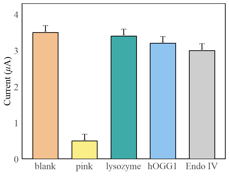
So many wonderful design choices! Chef’s kiss, mwah…
Have a happy new year, all y’all!
 .
.